material_theme
| Package | Kind | Provides the role | Needs | Choose with |
|---|---|---|---|---|
smf_material_theme | infrastructure | Theme | preferences | -m material_theme |
material_theme gives the app a light and a dark Material 3 theme. Both have the colors of one palette, the text styles of one font and the same look of the components, such as cards, buttons and sheets, so they differ only in their colors. The app shows the theme that the user selects, and follows the device until then.
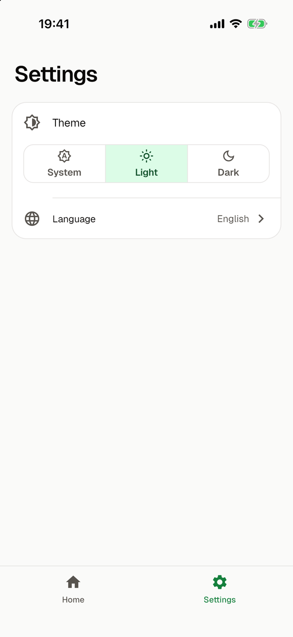
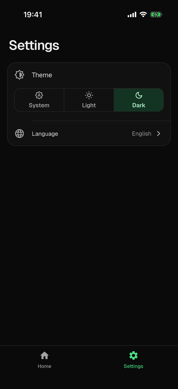
What it adds to the app
| In the app | What it is |
|---|---|
lib/core/theme/app_theme.dart | The two themes. Edit this file to change the look of the app. |
assets/fonts/geist/Geist-Regular.ttf, Geist-Medium.ttf and Geist-SemiBold.ttf next to it | The font of the themes, Geist, in the weights 400, 500 and 600. It has Latin and Cyrillic letters. |
assets/fonts/geist/OFL.txt | The license of the font, the SIL Open Font License. |
The module declares the family of the font in pubspec.yaml, and its license among the assets of the app, so that each copy of the app has the license with the font. In an app without other assets, the flutter section is:
flutter:
  uses-material-design: true
  assets:
    - "assets/fonts/geist/OFL.txt"
  fonts:
    - family: "Geist"
      fonts:
        - asset: "assets/fonts/geist/Geist-Regular.ttf"
          weight: 400
        - asset: "assets/fonts/geist/Geist-Medium.ttf"
          weight: 500
        - asset: "assets/fonts/geist/Geist-SemiBold.ttf"
          weight: 600
The files of the font are part of the app, so the app loads no font from the network. The themes are those of the material library of Flutter, so the module adds no package to the app.
Whichever module provides it, the theme role adds the theme mode:
lib/core/theme/theme_mode.dartwithappThemeMode, which keeps the mode that the user selected, saves each choice in the preferences and restores it when the app starts;- the
theme, thedarkThemeand thethemeModeof the rootMaterialApp, which takes the two themes from the functions ofapp_theme.dart; - in an app with a settings screen, the entry Theme, in which the user selects System, Light or Dark.
Theme describes the mode and how code reads and changes it.
The mode is saved in the preferences, so an app with this module has a module that provides them. smf create adds shared_preferences by itself while it is the only one that does.
In the guide for coding agents of the app, the theme role tells under "Theme" where the look is and how code changes the mode. The module adds how _themeOf creates both themes, where their colors and their font are, and what a change of the file must keep.
The file of the themes
lib/core/theme/app_theme.dart has three constants for colors, the family of the font, the two functions that the theme role requires, and three functions that build what they return:
| In the file | What it is |
|---|---|
seedColor | A green, the accent of the light theme. It is also the color from which ColorScheme.fromSeed gets the colors that _schemeOf does not set itself, such as those of an error. |
_deepGreen, _cream | The primary pair. The deep green is the primary color of the light theme and the color of what stands on the primary color of the dark one. The cream is the other way round. |
_fontFamily | The family of the font, as pubspec.yaml declares it. |
createLightTheme(context), createDarkTheme(context) | The light and the dark theme of the app. Each returns _themeOf of its brightness and leaves its context alone. |
_schemeOf(brightness) | The colors of a theme. |
_textThemeOf(scheme) | The text styles, in the font and in the colors of the scheme. |
_themeOf(brightness) | The ThemeData of a theme: its colors, its font, its text styles and the look of its components. |
This is the start of the file, without the functions that build the themes:
import 'package:flutter/cupertino.dart' show CupertinoPageTransitionsBuilder;
import 'package:flutter/material.dart';

/// The accent of the app, and the colour that `ColorScheme.fromSeed` derives
/// the colours from that [_schemeOf] does not set itself, such as those of
/// an error. The colours of the app are in [_schemeOf]: change them there
/// to give the app another look.
const Color seedColor = Color(0xFF15803D);

/// The deep green that the themes pair with [seedColor]: the primary colour
/// of the light theme, and the colour of what stands on the primary colour
/// of the dark one.
const Color _deepGreen = Color(0xFF0F3326);

/// The cream that goes with [_deepGreen]: the primary colour of the dark
/// theme, and the colour of what stands on the primary colour of the light
/// one.
const Color _cream = Color(0xFFF1F1E8);

/// The font of the app: the family that `pubspec.yaml` declares with the
/// files in `assets/fonts/geist/`, in the weights 400, 500 and 600. A text
/// of another weight gets the nearest of them. For another font, add its
/// files, declare its family in `pubspec.yaml` and name it here.
const String _fontFamily = 'Geist';

/// The light theme of the app.
///
/// The root of the app calls it each time it builds, so a change of this
/// file shows on a hot reload. [context] is the context of the root, above
/// its `MaterialApp`: it has neither the theme nor the localizations of the
/// app.
ThemeData createLightTheme(BuildContext context) => _themeOf(Brightness.light);

/// The dark theme of the app; see [createLightTheme].
ThemeData createDarkTheme(BuildContext context) => _themeOf(Brightness.dark);
The colors
_schemeOf starts from the scheme that ColorScheme.fromSeed gives for seedColor and sets most colors itself, for each brightness. This excerpt leaves out most of them:
ColorScheme _schemeOf(Brightness brightness) {
  final seeded = ColorScheme.fromSeed(
    seedColor: seedColor,
    brightness: brightness,
    dynamicSchemeVariant: DynamicSchemeVariant.fidelity,
  );
  return switch (brightness) {
    Brightness.light => seeded.copyWith(
      primary: _deepGreen,
      onPrimary: _cream,
      // ...
      secondary: seedColor,
      // ...
      surface: const Color(0xFFFAFAF9),
      // ...
    ),
    Brightness.dark => seeded.copyWith(
      primary: _cream,
      onPrimary: _deepGreen,
      // ...
      secondary: const Color(0xFF4ADE80),
      // ...
      surface: const Color(0xFF0A0A0A),
      // ...
    ),
  };
}
| Colors of the scheme | What they are |
|---|---|
primary, onPrimary | The deep green with the cream on it in the light theme, and the cream with the deep green on it in the dark one. |
secondary | The accent, a green: seedColor in the light theme and a lighter green in the dark one. The themes mark with it what is selected, such as the selected destination of a navigation bar. |
tertiary | An amber. |
surface and the surface containers | Neutral surfaces: near white in the light theme and near black in the dark one. surfaceTint is transparent, so a surface takes no tint of the primary color. |
outline, outlineVariant | The borders. outlineVariant is the hairline of the themes: around a card, around a segmented button and of a divider. |
Each of the first three has its container and the color of what stands on it, such as secondaryContainer and onSecondaryContainer.
The text styles
_textThemeOf takes the text styles of Material 3 in the font of the app and sets their weight and spacing:
| Styles | Weight | Spacing |
|---|---|---|
display…, headline…, title… | 600 | Tight letters, tighter for a larger style. |
body… | 400 | Lines 1.4 to 1.5 times the size of the text. |
labelLarge | 600 | |
labelMedium, labelSmall | 500 |
The components
_themeOf gives the ThemeData the scheme, the font and the text styles, makes surface the background of a Scaffold, and sets the look of the components:
In _themeOf | The look |
|---|---|
appBarTheme | An app bar in the color of the surface, flat also over content that scrolls under it, with its title at the start in titleLarge. |
navigationBarTheme | A flat navigation bar in the color of the surface, with the icon and the label of the selected destination in the accent, and the others in onSurfaceVariant. The bar of bottom_tabs takes its colors from here too. |
cardTheme | A flat card without a margin, with a hairline around it and corners of 20. |
filledButtonTheme | A filled button at least 60 high, with corners of 18. |
textButtonTheme | A text button in onSurfaceVariant. |
segmentedButtonTheme | Segments at least 44 high inside a hairline, with the selected one in the container of the accent. |
listTileTheme | A list tile with its title in bodyLarge. |
dividerTheme | A hairline that takes no more room than its own thickness. |
bottomSheetTheme | A sheet with a drag handle and top corners of 28. |
dialogTheme | A dialog with corners of 24. |
snackBarTheme | A floating snack bar in the inverse of the surface, with corners of 14. |
pageTransitionsTheme | The transition between two pages: FadeForwardsPageTransitionsBuilder on Android, and that of Cupertino on iOS. |
Change the look
-
For other colors, change them in
_schemeOf, for the light and for the dark theme. Keep the color of what stands on a color readable on it, such asonPrimaryonprimary. A change ofseedColoralone changes the accent of the light theme and the colors that_schemeOfdoes not set. -
For other text styles, change
_textThemeOf. -
What both themes share goes into the
ThemeDataof_themeOf, such as the theme of a component. For rounder cards, for one, change the radius in itscardTheme:lib/core/theme/app_theme.dartcardTheme: CardThemeData(
elevation: 0,
margin: EdgeInsets.zero,
color: scheme.surfaceContainerLow,
clipBehavior: Clip.antiAlias,
shape: RoundedRectangleBorder(
borderRadius: BorderRadius.circular(20),
side: hairline,
),
), -
For what differs between the two themes, use the
brightnessthat_themeOfgets. -
Keep
brightness: brightnessin the color scheme, so thatcreateLightThemereturns a light theme andcreateDarkThemea dark one. Keep both functions and theirBuildContextparameter too, since the root of the app calls them.
The root calls the two functions each time it builds, so a change of the file shows on a hot reload.
Another font
- Add the files of the font to the app, such as in a directory of their own in
assets/fonts/. - Declare its family in
pubspec.yaml, with a file for each weight, as the familyGeistis declared. - Name the family in
_fontFamily.
The themes ask for the weights 400, 500 and 600. A text of a weight that the family does not declare gets the nearest one that it does.
Keep assets/fonts/geist/OFL.txt among the assets while the app has the files of Geist. Once the app uses another font, remove the directory assets/fonts/geist/ together with its lines in pubspec.yaml.
Choosing it
smf create asks which module provides the theme of the app, and offers None as well. To choose this one without the question, here with a start screen, a settings screen and tabs at the bottom:
smf create my_app -m material_theme,home,settings,bottom_tabs
The run adds the modules that these need, and says why:
Adding flutter_core: the only provider of the app entry role, which every app needs.
Adding shared_preferences: the only provider of the preferences role, which material_theme requires.
Adding go_router: the only provider of the router role, which home requires.